Best Practices of Web Design which you can adopt in 2015
Web Designing is a constantly changing field and is getting to become more and more user-centric. Keeping abreast with the trends and adopting the best practices of web design aids in your web development as well as your online visibility. Our Web Design Dubai Team prepare this blog focused on throwing light upon five of the best practices to be adopted for this year, 2015.
See also: How to Create an SEO Friendly Web Design
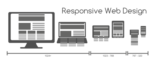
Go Responsive or Go Home
Responsive web designs have become the bedrock on which web designing has started getting created. Web Designs must be so created that they are rendered easily on any device a customer uses. If a website development does not adopt a responsive design, the designers might as well shut shop soon!
See also: Flat Web Design: A Glimpse on the Popular Trend!
Single Page Site
Single Page sites, mostly with Vertical Scrolling or Parallax Scrolling have become the buzz words of web designing today. Websites have long eschewed the multi-page web design which required the user to open every page individually. The advantages which a Parallax scrolling provides are multifarious. Some of these are an enhanced visual appeal, engaging user experience, and an intrinsic interactive nature incorporated within the site.
See also: User-Friendly Navigation in Your Web Design

More Scrolls and Lesser Clicks
The advent of Parallax Scrolling and Parallax Designs have resulted in websites becoming more scrolls oriented and reducing the number of clicks required of a user to view the information. Navigation, therefore, has become easy. Vertical and Horizontal Scrolling are providing the users with a great user experience. Somehow the reduction in the number of clicks required has seemed to reduce a certain amount of tedium and given rise to better user friendly nature of a website.
See also: How to make Retina Display Compatible Web Designs?
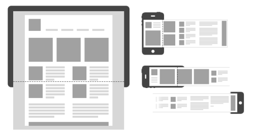
Mobile Friendly Approach to Web Designing
Website design has got revolutionized with the emergence of smart phones. Web Development now keeps in mind that many viewers will not be viewing the website through desktops or laptops. Hence the focus has shifted to the mobile user. Web Designing has now begun adopting a mobile friendly approach where the first construct of the website is done for mobiles and smaller electronic devices.
See also: Responsive Web Design Tips
Elements are subsequently added to facilitate further enhancements to the first construct for viewing on bigger devices. Responsive Web Designs begin by starting at a mobile friendly level.

Flat Designs are the foundations on which a mobile friendly approach to web designing begins. Cards have also started being increasingly used as they can fit into any device of any size.
See also: How to Reduce the Load Time in Responsive Web Design
Interactive User Interface and Web Apps
Interactive User Interfaces and intelligent web apps which help the user in a subtle manner are also key components of a great web design, and a fast catching trend. Incorporate quirky and cool widgets in your site and you will see the difference!
Website Development and Web Design trends have changed. Adopt these five pointers and you will definitely be at the start of the bandwagon in 2015! Happy Designing!
Was this useful? Tell us!
Disclaimer: All graphics/images are copyright to their respective owner unless stated otherwise. If you are the owner or you want to remove any of the graphic/image from this page please contact us HERE.