RSI Concepts Redesigns The Website For Bin Rashid Smart Learning Program

Muhammad Bin Rashid Smart Learning Program

Muhammad Bin Rashid Smart Learning Program

RSI Concepts is a leading web design Dubai firm,  was hired for web designing in order to revamp the website for the Muhammad Bin Rashid Smart Learning Program during the latter half of 2014. Muhammad Bin Rashid Smart Learning Program is a well known program student focused program. It has been created in order to seamlessly integrate cutting edge technology tools and globally renowned teaching methodologies into the existing education system of the United Arab Emirates.

See also: TRA Dubai Hire RSI Concepts to Design a User Friendly and Professional Website

Through Muhammad Bin Rashid Smart Learning Program, the intent is to catapult UAE’s education system into the next generation of learning and development. This would consequently empower the students to become future pioneers in various facets of life. The Muhammad bin Rashid Smart Learning Program. The Muhammad Bin Rashid Smart Learning Program is a joint venture between the Ministry of Education (MOE) and the UAE’s Telecommunications Regulatory Authority (TRA) in cooperation with the UAE Prime Minister’s Office.  Within a short span of a little over 2 years, the program has rapidly grown and is present in 800 classrooms in 146 schools in the nation.

See also: RSI Concepts is Hired to Design Website www.government.ae – The Government of UAE Continue reading “RSI Concepts Redesigns The Website For Bin Rashid Smart Learning Program”
Why You should Opt for a Responsive Web Design if You are running a Business in Dubai – UAE

Why you should opt for a responsive web design

Three Compelling Reasons to Opt for a Responsive Web Design if You are running an online or physical Business in Dubai – UAE

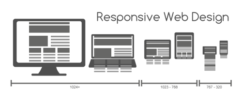
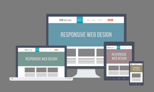
Responsive web designs are surely but swiftly taking over the world of websites. Their impacts are felt everywhere, and the Dubai region is no exception. Dubai is the hub of any business world and hence a website adhering to the latest trends becomes paramount. The leading web design agencies in Dubai are already adopting this new technology and most of them are using Bootstrap for responsive web designing. In this blog, we present you with three very compelling reasons to opt for a responsive web design if you are based out of Dubai.

See Also: How to Use SVG in a Responsive Web Design

Responsive Web Design is Critical
Responsive Web Design is Critical for Businesses

1. Internet Trends

Studies have pointed out that world over mobile internet users are fast replacing desktop users. It has been estimated that 94% of users access internet over mobile frequently and also access social networking sites. The smart phone sales are also constantly on the rise in Dubai and UAE. Given these trends and the future that they indicate, the obvious way forward is adopting a responsive web design.

See Also: User Experience is Now a Ranking Factor in Google Continue reading “Why You should Opt for a Responsive Web Design if You are running a Business in Dubai – UAE”

How to Use SVG in a Responsive Web Design

How to Use SVG in a Responsive Web Design

How to use the SVG Images in responsive web design to increase the performance quality and improved SEO

Scalar Vector Graphics image format or SVG image format as they are popularly known, have rapidly emerged as the sought after format. This blog of ours is focused on throwing light upon the SVG image format and also understand why it becomes compelling to use it in a responsive web design. Top web design companies in Dubai are using SVG to design the websites for their corporate and marketing clients.

Introduction

SVG is an XML centric vector image format. It has been developed for graphics in two dimensions and it also renders support for interactivity and animation. SVG is an open standard and has been adopted since 1999. SVG has been developed by the World Wide Web Consortium. Since SVG image format is XML centric, they can work the way other files defined in XML files do.

This implies that one can search, script, index or compress them. They can also be worked upon using any text editor; however they are predominantly accessed and used through drawing software. As the marketing trends are evolving rapidly and the use of Retina Display is becoming a quality standard the Retina Display Compatible Web Designs are getting popular which can easily be achieved using SVG along with the power of CSS3 and HTML5. All major browsers facilitate a certain degree of SVG support.

See Also: The Best Web Design Dubai Company

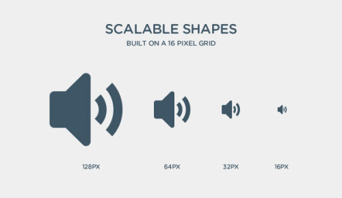
SVG-High Quality and hence scale without loss of clarity

With the current trends showing that the way forward is a responsive web design, here are three reasons why you should use SVG images in your web design: Continue reading “How to Use SVG in a Responsive Web Design”

User Experience is Now a Ranking Factor in Google

User Experience is Now a Ranking Factor in Google

How an effective web design can improve user experience hence your ranks in Google

User Experience is no longer restricted to businesses which are using a website to promote a product or to sell. The advent of Panda 4.0, Google’s latest addition to its ranking algorithm, has increased the significance of UX or User Experience. Google has started using user data to acknowledge websites which provide a great user experience by placing them on the top of a search. While provision of relevant and insightful information is definitely a must, it has now become essential to provide these in a user friendly manner as well. Otherwise the purpose is defeated, is it not?

See Also: How to Create an SEO Friendly Web Design

Web Design - User Experience and SEO Rankings
The Significance of UX or User Experience and Web Design

What is Google Panda 4.0?

Google Panda 4.0 is a modification incorporated by Google to its existing ranking algorithm. It has been done so in order to make sure websites with low quality are sifted and placed at the lower end of the Google ranking. Websites which provide in-depth and original information for a search get ranked higher. Google’s Panda 4.0 is a complex algorithm which considers ranking factors like the presence of relevant key words and originality of content and ideas to rank sites. If a website is deemed to provide solid, unduplicated information which makes a user feel secure about using the site, then the page gets ranked higher. Continue reading “User Experience is Now a Ranking Factor in Google”

How to Choose the Right Social Media Platform

How to Choose the Right Social Media Platform

You can spread your words to millions via social media platforms, here is how!

In today’s socially connected world, social media marketing have a significant role to play for any business or website. Social media platforms present one with the opportunity to connect with millions at one go. The best way to leverage social media platforms is to run campaigns to promote a product, create a brand, gather online visibility, or draw attention to a cause. Given the wide range of social media platforms available, which ones should you choose? Read on. Or let us take control of your social media marketing campaigns.

Spread Your Words to Millions via Social Media
Spread Your Words to Millions via Social Media Marketing

See Also: How to Create an SEO Friendly Web Design

Make your self clear of what you are willing to get from social media

Before you start your social media campaign, do some research, and define your goals. This is a crucial step which will help you in zeroing on your target audience and hence the choice of social media forums. Try to get as objective and detailed as possible. For example if you are looking to market a fashionable handbag which is a tad expensive, then obviously earning women who are fashion conscious are one segment of your target buyers. Your social media campaign can target this group.

See Also: Flat Web Design: A Glimpse on the Popular Trend! Continue reading “How to Choose the Right Social Media Platform”

User Interface and Web Design – Do and Don’ts

User Interface and Web Design – Do and Don’ts

Some Basics of User Interface Principle and Web Design

User Interface is that connect between an organization or a business and the user which has the potential to build or break the relationship. Yes, it did sound dramatic! Yet it is true.

Do pay attention to every detail of your user interface in your web design, and the reward will be multi-fold. This blog focuses on some basic principles which govern web designing and user interface.

Pay Attention to Every Detail of Your User Interface
The User Interface is a Connection between Organization and its Clients

See Also: Tips for a User-Friendly Navigation in Your Web Design

The Middle East is a rapidly growing region in terms of business and technology. So, being a Web Design Dubai Company we face a lot of challenging and sophisticated projects. Our designer and branding team work intensively to deliver those projects successfully. Our design team mostly follows Larry Constantine and Lucy Lockwood. Who are the acknowledged gurus of user interface designs. According to them:

The basic principles of User Interface are categorized as:

Structure principle:

It is centered on the entire user interface architecture. The User Interface and web design should be such that there is a demarcated difference in the way dissimilar things are represented and a marked similarity in the way similar things are represented. For example, there should not be a sudden change in colors or font sizes for representing the same product in an eCommerce website. The user gets primed to certain detailing as soon as they enter the site. The web design and user interface should preserve it. Continue reading “User Interface and Web Design – Do and Don’ts”

Web Design Tips for Mobile eCommerce in 2015

Web Design Tips for Mobile eCommerce in 2015

Three Web Design Tips & Trends to Follow in 2015 for Mobile eCommerce or mCommerce

Mobile eCommerce also sometimes generalized as mCommerce or m-commerce is buying or selling, especially retail products, using your mobile device or any handheld device like laptops. mCommerce is the superset of Mobile eCommerce and encapsulates any commercial  transaction undertaken using mobile phones or other handheld devices. Not only in Dubai but all over the world the web design agencies are now focusing much on mobile users. RSI Concepts is a leading Web Design Dubai company providing complete mobile solutions.

Web Design of eCommerce Portals
Adopt these trends and you will certainly be a top garner!

The number of mobile users has now overtaken the number of desktop users. A conglomeration of mobile users, tablets users, and laptop users have become a force to reckon in the eCommerce industry and in 2015 will have a larger role to play. Therefore the imminent need for eCommerce websites is to focus on a web design which caters to a user who accesses from any of these devices. This blog of ours will give you three web design tips to create eCommerce websites which are any electronic device friendly or let’s just say device agnostic!

See Also: eCommerce Web Design Trends and Best Practices

eCommerce Web Design and the need for Responsiveness

Responsive will be the keyword for website development in 2015. It is pivotal for an eCommerce website to be responsive as your buyer may be viewing and planning to buy from any electronic device. It makes sense to ensure that your web design accommodates the need of all these users. Every element of your eCommerce Website, be it the menus, the product pages, the payment gateways, or the shopping cart, should be responsive and easily accessible across all devices. Continue reading “Web Design Tips for Mobile eCommerce in 2015”

Five Web Design Best Practices For 2015

Five Web Design Best Practices For 2015

Best Practices of Web Design which you can adopt in 2015

Web Designing is a constantly changing field and is getting to become more and more user-centric. Keeping abreast with the trends and adopting the best practices of web design aids in your web development as well as your online visibility. Our Web Design Dubai Team prepare this blog focused on throwing light upon five of the best practices to be adopted for this year, 2015.

See also: How to Create an SEO Friendly Web Design

Go Responsive or Go Home

Responsive web designs have become the bedrock on which web designing has started getting created. Web Designs must be so created that they are rendered easily on any device a customer uses. If a website development does not adopt a responsive design, the designers might as well shut shop soon!

Responsive Web Design Tips to Keep up with the Current Trends
Responsive Web Design Best Practices to Keep Up With the Current Trends

See also: Flat Web Design: A Glimpse on the Popular Trend!

Single Page Site

Single Page sites, mostly with Vertical Scrolling or Parallax Scrolling have become the buzz words of web designing today. Websites have long eschewed the multi-page web design which required the user to open every page individually. The advantages which a Parallax scrolling provides are multifarious. Some of these are an enhanced visual appeal, engaging user experience, and an intrinsic interactive nature incorporated within the site.

See also: User-Friendly Navigation in Your Web Design

Vertical Scrolling or Parallax Scrolling
Single Page Sites – Vertical Scrolling or Parallax Scrolling

More Scrolls and Lesser Clicks

The advent of Parallax Scrolling and Parallax Designs have resulted in websites becoming more scrolls oriented and reducing the number of clicks required of a user to view the information. Navigation, therefore, has become easy. Continue reading “Five Web Design Best Practices For 2015”