Web Design Dubai industry is evolving rapidly as the use of mobile devices to browse the internet in Dubai is excessively increasing!
Responsive Web Design Dubai has become a buzz word in the UAE industry. A web design needs a radical change in the current approach to make it a responsive one. How to come up with a responsive web design is a question every web designer is constantly endeavouring to answer. Industry trends are rapidly evolving in Dubai web design industry. In this blog, we try to elicit some ways and reasons on how bootstrap will assist in creating a responsive web design.
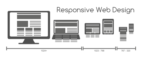
Two key elements of a responsive web design which has by and large been a pain point for designers has been the need to use a lot of CSS coding and the increased testing time, where you test on any and every device possible. As most of the internet users in UAE are using mobile devices and a statistical report suggests that more than 70% of the internet surfers in Dubai are using mobile devices. So, the need to test the web design on each and every platform available in the market is exceedingly high. This is where bootstrap can ease the burden of a web designer.

See Also: Why You should Opt for a Responsive Web Design
Bootstrap is defines as a “sleek, intuitive, and powerful front-end framework for faster and easier web development.” It has been developed to ensure that it works supremely fine on all devices.
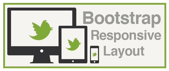
Why Use Bootstrap for a Responsive Web Design?
Twitter’s Bootstrap offers a horde of benefits when you are trying to create a responsive web design. The first one being the facet of global styles for the body which can be used to reset type and background, along with the facility of being able to link styles, the presence of two simple layouts and a grid system.
See also: How to Reduce the Load Time in Responsive Web Design
Attractive Typography, Buttons, Tables and other Design Elements
Bootstrap also has a plethora of styles for typography, tables, forms, buttons and other common HTML elements. Bootstrap has easy and simple styles for interface components such as navigation bar, alerts, and the like. A responsive web design pays a lot of attention to the menu and navigation elements. These easy to use facilities inherent in bootstrap make it a great asset when one has to create a responsive web design with user friendly navigation and it also helps designing responsive flat web design.
See also: User Experience is Now a Ranking Factor in Google
Java Plug-Ins and other Accessories for Bootstrap
Furthermore, bootstrap has innumerable Java plug-ins for segments like modals and popovers. Bootstrap offer designers the facet of being supremely customizable and different. All the components of bootstrap are available for every designer to make use of, yet the aspect of personalization and creativity which can be incorporated in every design makes for a great responsive web design. Complete control over all the design elements empowers a designer to unleash their creativity, yet subtly assisting with the responsive nature of the design.
See also: How to make Retina Display Compatible Web Designs?
Bootstrap has a fluid layout and flexibility, which gives website developers a lot of time to channelize towards the creation of a world class UI. Bootstrap works seamlessly with anything a designer may want. For example, centring of layouts for any device, hardware acceleration for hassle free page transitions, CSS3 effects and transitions, are all rendered by bootstrap and are essential for a responsive web design. This way a coder need not heavily code. Edge Inspect helps in testing on iOS and Android devices, shortening the testing cycle. Creating Retina Display compatible web designs is not a big deal with bootstrap.
See also: How to Create an SEO Friendly Web Design
All the aspects of bootstrap are very easy to understand. In a nutshell, developers can use bootstrap with ease to create responsive web designs.
Disclaimer: All graphics/images are copyright to their respective owner unless stated otherwise. If you are the owner or you want to remove any of the graphic/image from this page please contact us HERE.
Hi Sir/Madam
Greetings of the day!
We’re a passionate group of Web Design and Development, Creative’s and technologists,
expert in what we do . Our Company insight and expertise has leaded us to structure our
solutions in such a way that reduces operational cost, increases customer satisfaction and
adds value to the deliverables.
We are ISO 9001:2008 certified primary focused on Web Designs , SEO, Mobile Apps
and Enterprise Apps Development.
Please let us know in case you are interested and want to get your new idea or business to start with.
We can surely provide a complete new website, application or/and mobile app as required.
I would be glad to schedule a Skype / Phone call in order to discuss the project in detail.
Many thanks for having your kind look to our email.
Thanks & Regards,
Amaia
Looing forward to your kind response.